Fashion Photography Services
E-commerce Photography
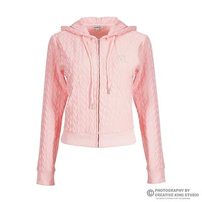
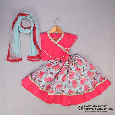
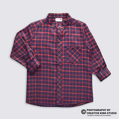
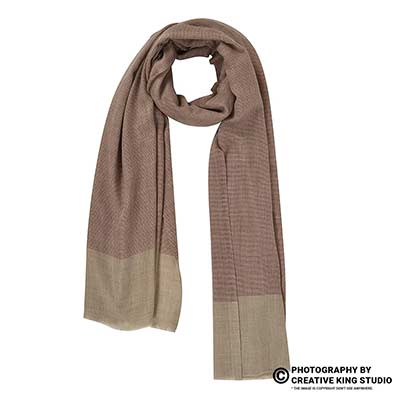
A slot-by-slot plan for secondary images that explain your product, read clearly on a phone and stay inside Amazon’s image rules.
Amazon infographic images are the secondary photos in slots 2 to 7 that use short text, icons and callouts to explain what a product does, and they are where most Indian sellers either win the shopper’s trust or quietly break an image rule. This checklist sits under our Amazon seller hub, and it answers one problem: what can you safely show on those slots in 2026-27, and how do you plan it so the listing never gets flagged?
I am Prince, founder of Ckstudio, and our studio has shot marketplace catalogues since 2015. The pattern we see is consistent: sellers spend on a designer, but the designer starts from a cluttered phone photo, copies claims the bullets never make and squeezes text that nobody can read on a 6-inch screen. The fix starts before design, with a shot list built for overlays. If you want a second opinion on your current gallery, call +91-8700258773 or send the ASIN to [email protected].
In this guide
Amazon allows text, graphics and lifestyle scenes on additional images, but not on the main image. Your amazon infographic images can therefore carry feature callouts, dimensions and comparison layouts, as long as they show the real product accurately and avoid Amazon’s own logos, badges and anything that misrepresents what the buyer receives.
The rule that matters most is the split between slot 1 and everything after it. The Amazon Seller Central product image requirements keep the main image strict: a pure white background, the product filling most of the frame and no added text, logos or borders. The same page relaxes those rules for additional images, which is exactly why slots 2 to 7 are where infographics live. Read the page yourself before every catalogue refresh, because Amazon updates wording and adds category notes without announcing them.
Freedom on secondary slots is not unlimited. Amazon still expects every image to represent the product you are selling, at a size that supports zoom, in an accepted file format. It also restricts its own trademarks, so badges that imitate Amazon’s Choice or Best Seller labels are not allowed on any slot. If you need a designer who knows where this line sits, our Amazon product infographic design work starts from your bullets and the policy page, not from a template.
| Rule area | Main image (slot 1) | Additional images (slots 2-7) | Source |
|---|---|---|---|
| Text, icons, callouts | Not allowed | Allowed when they describe the real product | Seller Central image requirements |
| Background | Pure white | Any, including lifestyle scenes | Seller Central image requirements |
| Amazon logos and badges | Not allowed | Not allowed (no imitation of Amazon’s Choice, Best Seller and similar labels) | Seller Central image requirements |
| Size for zoom | 1,000 px or more on the longest side | Same; zoom matters even more for text | Seller Central image requirements |
| File format and colour | JPEG preferred; TIFF, PNG or non-animated GIF; sRGB | Same | Seller Central image requirements |
| Non-compliance | Listing can be removed from search | Listing can be removed from search | Seller Central image issues page |
Amazon does not publish an official minimum font size or a maximum word count for infographics, and it does not publish an India-only infographic rulebook either. Anyone quoting a precise “Amazon font rule” is quoting a design habit, not policy. What Amazon does publish is category style guides inside Seller Central, and those can be stricter than the general page, which is why section five of this checklist covers them separately.
The safest infographics are factual: a dimension diagram drawn on a true product photo, a materials callout that repeats a bullet, or a what’s-in-the-box layout that matches the pack contents exactly. Each one is verifiable against the listing text, so a reviewer or a shopper can never call it misleading. Promotional claims, competitor references and guarantees that your bullets never mention are where policy trouble starts.
Give each secondary slot one job. Infographic slots explain features, lifestyle slots show the product in use, and size-comparison slots answer “how big is it?” before the shopper has to ask. Mixing all three jobs into one crowded frame is the most common reason a secondary image fails on mobile.
Shoppers swipe the gallery quickly on a phone, so a slot that tries to say four things usually says none of them. Our main image checklist handles slot 1; the decision table below handles the rest. The order shown is a starting point for most hard goods. Fashion, beauty and jewellery shift the balance towards on-model and texture shots, but the one-job rule never changes.
| Image type | Its job | Best slot | Policy risk to watch |
|---|---|---|---|
| Feature infographic | Turn 3 to 4 bullets into icons and short labels | 2 or 3 | Claims not backed by the listing text |
| Detail macro with callouts | Prove material, finish or stitching | 3 | Retouching that changes the real texture |
| Size comparison | Show scale against a hand or common object | 4 | Props that look included in the pack |
| Lifestyle in use | Show the product solving a real task | 5 | Extra products the buyer may think they receive |
| What’s in the box | Show every item shipped | 6 | Showing accessories that are not included |
| Comparison or care chart | Variants, care steps or own-range comparison | 7 | Naming or showing competitor brands |
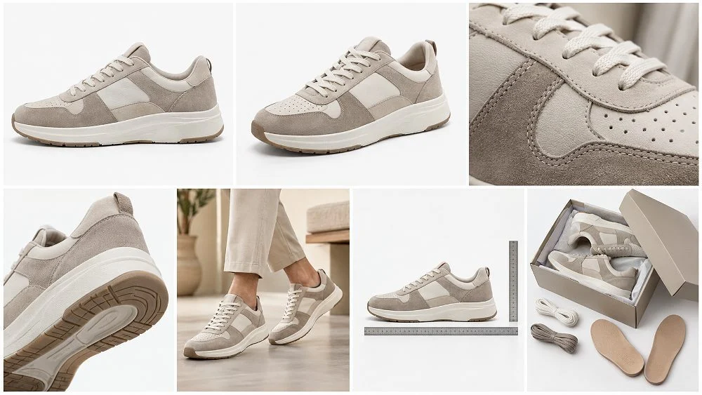
A size-comparison slot deserves extra care. Shoppers in India often compare a bottle against a familiar object, such as a hand, a laptop bag pocket or a standard A4 sheet. Use objects that are obviously props and keep them in neutral colours. A bright branded object next to your product invites confusion about what ships, and that confusion becomes a “not as described” return later.
Lifestyle images are where e-commerce sellers overspend. One strong in-use frame beats three staged scenes, and you can still add a single short label on a lifestyle image if it states a fact the scene cannot show, such as “keeps drinks cold for the hours stated on your pack”. Keep the label in a corner that the product never crosses.
Design at full size, then judge at phone size. Short labels of two to five words, one typeface family, strong contrast and a clean product photo with planned empty space keep amazon infographic images readable when a shopper swipes through the gallery on a phone without zooming.
Because Amazon publishes no font-size rule, legibility has to be tested rather than assumed. The Ckstudio catalogue team uses a simple habit: export the image, open it on an ordinary mid-range Android phone at normal brightness, and hold it at arm’s length. If any label needs a second look, it is too small or too long. This test catches more problems than any design checklist, and it takes a minute.

English remains the safe default because your listing text, search terms and most competitor galleries on amazon.in are in English. If your buyers are strongly regional, a single bilingual label can help, but keep the same claim in both languages and make sure it also appears in the bullets. Never split one fact across two languages on the same slot; it doubles the text and halves the size of each label.
Colour carries meaning too. Use your brand colour for icons and headings, and keep body labels neutral. A gallery where every slot uses the same palette, margins and icon style looks like one brand; a gallery assembled from three freelancers looks like a reseller, and shoppers notice the difference even when they cannot name it.
Every claim on an infographic should already exist in the title or bullet points. Matching them keeps the listing consistent, gives shoppers the same promise twice, and removes the risk of an image claiming something the product page never states or the product cannot prove.
At Ckstudio we build a simple claim map before any design starts. List the five bullets, mark the three that a picture can prove, and assign each to a slot. A bullet about capacity becomes a dimension diagram, a bullet about material becomes a macro with one callout, and a bullet about what is included becomes the in-box shot. Any fact that is not in the bullets either gets added to the bullets first or stays off the image.
Example scenario
Imagine a 750 ml insulated steel bottle with five bullets: double-wall insulation, leak-proof lid, fits standard car cup holders, food-grade steel, and a pack containing the bottle plus one spare lid. Slot 2 shows three icons for insulation, lid and steel. Slot 3 is a macro of the lid seal with one label. Slot 4 shows the bottle in a car cup holder for scale. Slot 6 shows the bottle and the spare lid, and nothing else. The numbers here are illustrative only; your own bullets set the claims.

Matching also protects you when a listing is reviewed. If an image says “BPA-free” and the bullets are silent, a buyer complaint has nothing to stand on except your graphic. If both say it and you hold the test report, the claim is defensible. This is why we ask sellers to share their bullets and any lab or certification documents before we plan an infographic set.
Three is a sensible ceiling for a feature slot and one is enough for a detail slot. Beyond that, the eye stops reading and starts scanning, and the extra claims dilute the main one. If a product genuinely has eight selling points, split them across two infographic slots and A+ modules instead of crowding one frame.
Titles deserve the same discipline. If your title says “750 ml” and the dimension diagram says “800 ml capacity”, the mismatch confuses shoppers and invites returns. The Ckstudio design desk proofs every number on the artwork against the live listing before export, and again after upload, because Flipkart and Amazon listings for the same SKU often drift apart over time.
Download the style guide for your category from Seller Central before design starts. Category guides can add rules the general image page does not mention, such as how clothing must be shown or what packaging may appear, and they decide whether a particular infographic idea is acceptable at all.
Style guides are maintained per category and change without notice, so treat any summary, including this one, as a prompt to check rather than a rulebook. The table below lists the questions we ask for each category before a single label is drafted. It does not quote numbers, because the numbers belong to the guide you download that week.
| Category | Check in the style guide | Infographic idea that usually fits |
|---|---|---|
| Clothing and fashion | Model, mannequin and flat lay rules; kids’ clothing presentation | Fabric and fit callouts on a clean on-model or flat lay photo |
| Jewellery | Background, scale and how sets are shown | Size-on-hand view with a single dimension label |
| Beauty and personal care | Ingredient claims and packaging display | Texture swatch plus key ingredients already in the bullets |
| Electronics and accessories | Ports, compatibility and what is in the box | Port diagram on a true product photo |
| Home and kitchen | Dimensions, capacity and material claims | Dimension drawing over a clean product plate |
Two habits make this step practical. First, save the guide with the download date in the file name, so your team knows which version the artwork was checked against. Second, keep a one-page note per category listing the three rules that affect your images most. Designers rarely read a full style guide; they will read a one-page note.
Kitchen and home products deserve a specific warning. Capacity, dimensions and material grades are the claims shoppers check after delivery, so a diagram must be measured on the actual SKU, not copied from a supplier sheet. We measure with a steel rule and a digital calliper on set and photograph the measurement for our own records, so the number on the image has a source.
For fashion, remember that the presentation rules for the main image also shape what looks natural on secondary slots. A gallery that switches between ghost mannequin, model and hanger shots without a reason looks inconsistent, and a size chart dropped onto a lifestyle photo is hard to read. Keep size charts on a plain panel in their own slot.
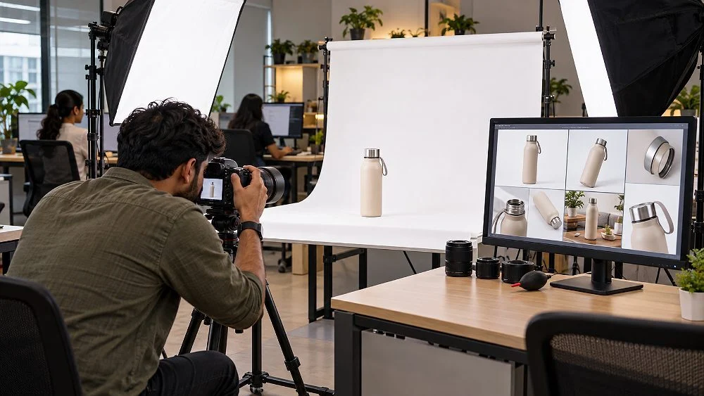
Shoot the product on white or a light neutral surface, off-centre, with planned empty space for labels, even lighting and accurate colour. A clean plate lets the designer place callouts without retouching around clutter, and it keeps the real product visible under every graphic.
Most weak amazon infographic images fail before the designer opens the file. A phone photo on a cluttered desk forces heavy cut-out work, the edges look soft, and the product colour drifts. A plate shot for overlays solves all three problems at the source, and it is the part of the job our studio cares about most.
From the studio floor
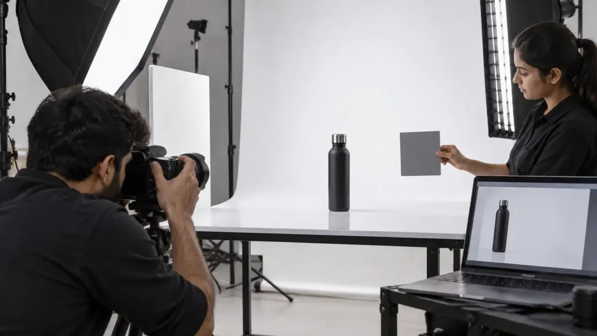
For a bottle or jar plate we use a full-frame mirrorless body with a 100mm macro or a 50mm lens, depending on size, on a tripod at product mid-height. The key light is a large softbox at about 45 degrees, a strip box sits behind on the far side for a clean edge highlight, and a white foam board fills the front. We stop down to around f/8 to f/11 so the whole product stays sharp, tether to a laptop, and place a grey card in the first frame of every SKU for colour balance.
Placement matters as much as light. We frame the product one-third from the side where labels will sit and leave the opposite area empty and evenly lit. For a dimension diagram we shoot a straight-on front and a true side view with the camera level, because a tilted view makes drawn measurement lines look wrong. For a detail callout we shoot one tight macro of the feature the label describes, and nothing else.
From the studio floor
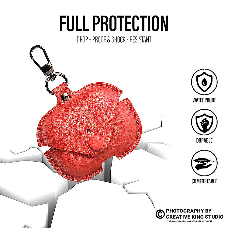
Reflective steel and glass need flags as much as lights. We use two black flags just outside the frame to shape a dark edge line, so the product outline stays crisp against white. Files go to the designer as 16-bit TIFF masters in sRGB, at least 2,000 px on the longest side, with a clipping path and a separate shadow layer. QC checks are simple: edges clean at 100 percent zoom, colour matched to the physical sample under daylight, and no dust on the lid or seal.
Here is the real production side of this work. The short film below shows how a marketplace accessory shoot is lit and framed in the studio, which is the same discipline a clean infographic plate needs.
The mistakes that cause trouble are predictable: Amazon-style badges, claims the listing does not support, props that look included, competitor references and low-resolution exports. Each one has a simple fix, and most of them are cheaper to prevent at the shoot than to correct after a listing is suppressed.
The Seller Central image issues page explains that listings with non-compliant images can be removed from search until a compliant image is uploaded. That is the real cost of a careless infographic: not a warning, but a listing nobody can find. If you are already dealing with a suppressed ASIN, our guide to fixing a suppressed Amazon listing walks through the recovery steps.
The last mistake is growing fast. Generated product renders often change the shape of a lid, the number of buttons or the texture of a fabric, and shoppers notice on delivery. When the base photo is the weak link, Amazon listing photography shot to the marketplace rules fixes the problem at its source, because every overlay then sits on the real product.
A final check catches most of these errors: print the six secondary slots as small thumbnails on one A4 sheet and ask someone outside the team what the product is, what is included and what makes it different. If they misread any slot, change that slot before upload, not after reviews start mentioning it.
Plan the claims first, shoot plates for overlays second, design and test on mobile third, and upload only after a policy check against the current Seller Central pages. Treating photography and design as one workflow is what keeps amazon infographic images both persuasive and compliant.
At Ckstudio the same team plans the shoot and briefs the designer, so nothing is lost between the photo and the artwork. The steps below are the order we follow for a typical hard-goods listing. Fashion and jewellery add on-model and macro stages, but the sequence of plan, shoot, design and check stays the same.
For home and soft goods, a short product film can do the job of two static slots. The example below shows an Amazon home product presented on video, which pairs well with one feature infographic and one size slot.
Want us to check a gallery against this list before you upload? WhatsApp the ASIN to +91-8700258773 and Prince or the team will reply during working hours, 10 am to 7 pm.
Yes. Amazon’s image requirements allow text, graphics and lifestyle scenes on additional images. The main image must stay free of text. Keep secondary text factual, readable on mobile and consistent with your bullets.
Slot 2 or 3 usually works best for the main feature infographic, right after the main image and one angle view. Size comparison and lifestyle images follow, and the in-box slot comes near the end.
Amazon does not publish one. Use short labels, strong contrast and a phone test at arm’s length; if any label needs a second look, enlarge it or cut words.
No. Amazon’s image rules prohibit its logos and trademarks, including badge-style labels such as Amazon’s Choice and Best Seller, on listing images. Use neutral icons for provable product facts instead.
Amazon enables zoom from 1,000 px on the longest side. We export amazon infographic images at about 2,000 px in sRGB so text stays crisp when shoppers zoom on desktop.
Yes. Ckstudio plans the claim map, shoots clean plates in the studio and designs the infographic layouts as one job. Call +91-8700258773 or email [email protected] with your ASIN and bullets.
Secondary slots are where a listing explains itself, and they reward discipline more than decoration. Start from the policy page and your own bullets, shoot plates built for overlays, and test every layout on a phone. Amazon infographic images made this way rarely trigger policy issues, because each label is true, readable and backed by a real photograph.
Next step: once your infographics are ready, place them in the right sequence with our guide to the best 7-photo order for Amazon listings.
Share your ASIN, bullets and category, and we will suggest a slot plan and a shot list for policy-safe infographics. Call Prince or WhatsApp +91-8700258773, or see our infographic design service.
Call Prince: +91-8700258773