

Fashion Photography Services


E-commerce Photography
A design-led, conversion-focused walkthrough of Flipkart A+ listings — from product photography and visual hierarchy to rich content, comparison sections and mobile-first layouts — built around the Ckstudio 7-Layer Flipkart Conversion Framework.
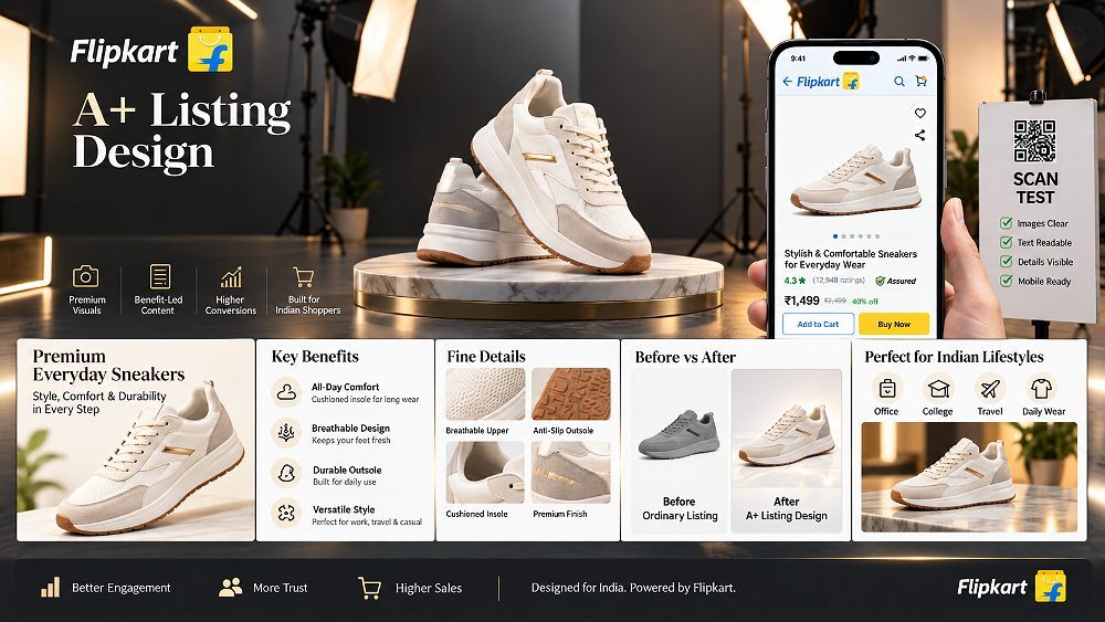
Flipkart’s product detail page has quietly become one of the highest-stakes creative surfaces for Indian D2C brands. A shopper scrolls through it on a phone for under a minute, forms a decision, and either adds to cart or moves to the next listing. That short scan is where Flipkart A+ listing design earns or loses its return on investment. In this design-led guide, we cover everything from Flipkart Rich Content and product photography to comparison charts, mobile-first layouts and a proprietary conversion framework used inside our production workflow.
At Ckstudio, we plan Flipkart product pages the same way we shoot a catalogue — every image, feature graphic and comparison module must answer a real buying question. This article is written for established Flipkart sellers, marketplace managers and premium D2C brands who already understand the basics of A+ content and now want to design product pages that convert. If you are still evaluating the marketplace itself, our Flipkart product photography guide 2026-27 is a useful companion read.
A Flipkart A+ listing — sometimes called Flipkart Rich Content or enhanced product content — is a product detail page that uses stronger visual storytelling, benefit-led feature blocks, lifestyle photography, comparison graphics and brand context to help shoppers evaluate a product more confidently. It sits inside the standard Flipkart product template, but replaces plain text descriptions with structured, mobile-optimised modules that behave more like a mini-landing page.
The difference between a basic listing and a well-designed A+ listing is not decoration — it is decision support. A basic listing tells the shopper what the product is. A conversion-focused A+ listing tells them why it fits their use case, how it compares to nearby options, and what to expect when it arrives. If you are new to the format, Flipkart’s own overview is a useful reference, and we have covered the fundamentals in our Flipkart A+ content guide 2026-27.
The gap between a standard Flipkart product page and a rich A+ listing shows up most clearly on mobile, where shoppers scan visuals faster than they read specifications. A well-planned Flipkart listing design combines product-first imagery, benefit graphics and comparison modules so the buyer never has to leave the page to make a decision.
| Element | Standard Listing | Conversion-Focused A+ Listing | Buyer Benefit |
|---|---|---|---|
| Main imagery | Single product photo | Planned image sequence with angles, details, lifestyle | Fewer unanswered questions |
| Feature communication | Bullet points in specs | Benefit-led feature graphics | Faster comprehension |
| Product details | Text description | Detail close-ups + labelled diagrams | Confidence in quality |
| Lifestyle context | Usually absent | Use-case photography | Product feels relevant |
| Comparison | None | Variant/model comparison chart | Right SKU chosen |
| Brand story | Missing | Short brand credibility block | Trust reinforced |
| Mobile readability | Not optimised | Mobile-first layout | Shorter decision path |
| Purchase objections | Left to reviews | Addressed in content | Lower return rate |
Marketplace shoppers in 2026 behave less like readers and more like scanners. They swipe through image carousels, jump to the comparison section, glance at ratings and decide within a very short window. In this environment, the visual hierarchy of a Flipkart product page matters as much as the description, and often more. A well-planned Flipkart A+ design reduces the cognitive load of that scan by placing the most decision-critical information exactly where the eye travels.
This becomes even more important for premium products, complex categories and multi-variant catalogues. Fashion buyers want fit and drape. Beauty buyers want texture, shade and ingredient logic. Electronics buyers want compatibility and specifications translated into everyday benefits. The right Flipkart product page optimisation converts these implicit questions into visual answers — through better image selection, dimension graphics, comparison sections and lifestyle context. For a deeper look at how this maps to shopper behaviour, our product photography and conversions guide is a good next read.
It is worth being honest here: better presentation cannot rescue an under-priced, poorly reviewed or badly stocked product. What A+ design can do is compound the impact of everything else you are already doing well. Reviews are stronger when the images match reality. Ads convert better when the landing page answers objections. Repeat purchases go up when the product genuinely matches the way it was shown. Design supports the decision — the product itself has to earn it. According to Flipkart Seller Hub, sellers who invest in enhanced content and quality images consistently see improved page engagement.
Over the last several years of shooting and designing marketplace catalogues, we noticed the same pattern in every listing that converted well: it answered seven layers of buyer questions in a specific order. We now use this as our internal planning framework for every Flipkart A+ design engagement. Instead of jumping straight to visuals, we plan each layer first — then let photography and design follow.
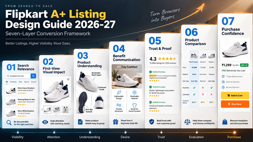
Accurate product naming, correct category, clear specifications and search-aligned attributes. Never sacrifice relevance for creative language — Flipkart product listing optimisation begins here.
The main image and thumbnail sequence must make category, size and product type recognisable within one glance. Consistent framing across the catalogue matters more than clever composition.
Dimensions, materials, usage, fit and compatibility — communicated through diagrams, callouts and close-ups. Great Flipkart A+ content answers “what exactly am I buying” without ambiguity.
Every feature must translate into a buyer benefit. “35L capacity” becomes “fits laptop, gym kit and 3-day travel”. Feature graphics do this translation work.
Accurate visuals, certifications where applicable, material and process information, warranty details. Trust in a Flipkart product page is built by matching what shoppers eventually receive.
Help shoppers pick the right variant or model without leaving the product family. Good Flipkart comparison chart design keeps the buyer inside your catalogue.
Answer final objections: size, compatibility, care, what is included, ideal customer. This is where a conversion-focused listing seals the decision.
Once the seven layers are mapped, the actual page design follows a fairly predictable structure. These eleven principles are the ones we apply to almost every Flipkart A+ listing we design, regardless of category. They are ordered roughly the way a shopper’s attention travels through the page.
The top of the page is not the place for a tagline. Combine product + primary benefit + ideal customer in a single, honest line. For example: “35L travel backpack for professionals who commute and travel light.” This one-line proposition guides every design decision that follows — image order, feature graphics and the tone of your Flipkart A+ content.
The order of your images is a design decision, not a guess. We recommend planning a shot list before any Flipkart product photography begins — it is far cheaper than reshooting later. A predictable, logical sequence also makes catalogue expansion easier as your SKU count grows.
For sellers scaling to hundreds of SKUs, this sequence becomes a template — new products can be shot against it, rather than every listing being planned from scratch. Our SKU scaling workflow covers this in detail.
The most useful formula we apply inside Flipkart Rich Content is simple: Feature → What it does → Why the buyer should care. A “water-resistant coating” becomes “shrugs off unexpected drizzle on your commute”. This translation work is what separates listings that feel like brochures from listings that feel like recommendations.
For categories like furniture, bags, home décor, appliances, fashion and jewellery, dimension diagrams reduce returns more than any other single graphic. A tape-measure overlay, a hand-holding-the-product reference or a room-scale placement image answers the question shoppers otherwise abandon the page to Google.
Lifestyle imagery is not decoration — it is context. A skincare pump shown mid-use, a kurta styled with denim, a kitchen appliance in a real kitchen — each tells the shopper “this is what your day will look like with this product.” Professional lifestyle product photography planned alongside your A+ design ensures the visuals feel intentional rather than staged.
Brand story belongs on the Flipkart product page, but late — after product decision information. A short block on materials sourcing, craftsmanship or the small team behind the brand can reinforce trust. A full brand history at the top of the page slows down decisions and pushes real product information below the fold.
If you sell more than one model or variant, a comparison chart is one of the highest-return modules in a Flipkart A+ listing. It answers “which one should I buy” without sending the shopper back to search results — where they might click a competitor instead.
Every category has a small set of predictable objections. Fashion: fit, fabric, shrinkage. Beauty: skin type, shade match, ingredients. Electronics: compatibility, warranty, box contents. Design a dedicated block that answers these upfront. It reduces returns, protects reviews and improves overall Flipkart product page optimisation.
Catalogue consistency is a superpower that most sellers underuse. Consistent framing, background colour, lighting and graphic style across your entire product family makes your brand feel more premium — even when individual SKUs are affordable. This is where catalogue consistency at scale becomes a strategic asset rather than a design nice-to-have.
Most Flipkart traffic is mobile. If your feature graphic has small text that a laptop preview shows perfectly, but a phone reduces to unreadable — the graphic has failed, regardless of how good it looks in Figma. Design at mobile scale first, then confirm desktop after.
This is the principle that decides most of our creative debates: every image, block and graphic must answer a specific buying question. If it does not, it is decoration — and decoration slows shoppers down. This filter alone will improve most catalogues more than any new design trend.
Photography is where most Flipkart A+ listing projects either take off or run into avoidable delays. The core issue is not equipment or lighting — it is planning. The images the design layout will need must exist before the design begins, otherwise you end up cropping, upscaling or reshooting later. In our workflow, the Flipkart product photography and ecommerce model shoot is planned side by side with the A+ layout.
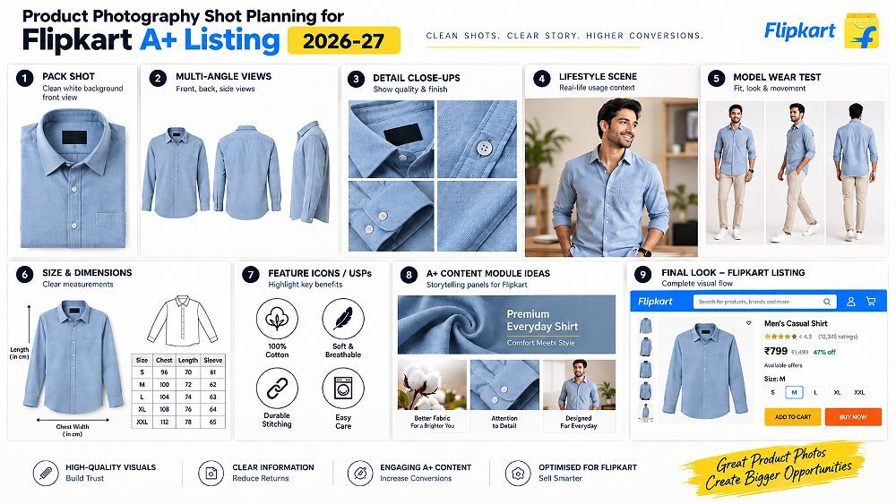
The primary pack shots on a white or neutral background remain the backbone of any Flipkart product images set. Colour accuracy, sharpness, correct proportions and consistent shadowing across the catalogue matter more than clever angles. This is also what Flipkart’s own image guidelines optimise for on category and search pages.
Close-ups do the work of a thousand words in the specifications block. Stitching, fabric weave, finish quality, dial detailing, closure mechanism, texture, packaging — each becomes a trust signal inside your Flipkart A+ content. These images are what turn a “looks nice” scroll into a “this feels well-made” decision.
Lifestyle images place the product inside a believable use case. For fashion, this means styled looks against real environments. For beauty, application and shelf-context shots. For home, the product placed in the kind of room the target buyer actually lives in. Done well, lifestyle photography is the single most powerful bridge between “product” and “purchase decision”.
Fashion, footwear, eyewear, watches, bags and any wearable category benefit enormously from model photography. Shoppers need to see fit, drape, scale and styling. For premium brands, the model choice, styling direction and background palette also carry brand cues that flat-lays cannot deliver. When we plan a shoot for a fashion catalogue, we align the model direction with the eventual Flipkart listing design so the images fit the comparison and lifestyle modules directly.
This is the shot type most sellers forget to plan. Infographic-ready photography leaves deliberate negative space around the product so designers can overlay callouts, arrows, feature labels and dimension lines without cropping into the subject. Once you build this into your shot list, your Flipkart A+ design production speed roughly doubles.
Great Flipkart Rich Content is more edited than designed. Every module carries one core message, expressed visually, that a shopper can absorb without stopping their scroll. This section covers the four editorial rules we apply inside every rich content module.
A single module trying to say three things ends up saying nothing. Split it. If a fabric is both breathable and quick-drying, those are two graphics — not one crowded panel. This discipline is what gives strong Flipkart A+ content its calm, premium feel.
Every visual module headline should describe a benefit, not a feature. “Antimicrobial coating” is a spec. “Stays fresh even after long commutes” is a benefit. Benefit-led headlines are what shoppers actually scan for.
Long paragraphs inside images are unreadable on mobile. As a rule of thumb: if a graphic has more than one short sentence of body copy, it needs to be redesigned or split. Text-heavy graphics also age badly — every future revision means re-editing an image file instead of updating a caption.
A row of decorative icons at the top of every A+ page has become a marketplace cliché. Use icons only when they compress a longer explanation into a recognisable symbol — dimensions, warranty, materials, care. Otherwise, they are just noise.
Product comparison is one of the most under-designed modules in Indian marketplace listings, and one of the highest-return elements in a Flipkart A+ listing. A clean comparison keeps shoppers inside your catalogue instead of pushing them back to Flipkart search — where a competitor might win the click.
Focus on differences that actually influence the buying decision. Model, size or capacity, material, main benefit, ideal use, compatibility and key differentiator are usually enough. Anything more starts to feel like a specifications table — which shoppers already have below the fold.
| Product Feature | Weak Copy | Better Benefit-Led Message | Recommended Visual |
|---|---|---|---|
| 35L capacity backpack | 35L capacity | Fits laptop, gym kit and 3-day travel | Packed-open shot with labels |
| Cruelty-free serum | Cruelty-free | Vegan, cruelty-free formula tested on volunteers | Product + certification icon |
| Solid wood dining table | Sheesham wood | Solid Sheesham wood, built to last a decade | Detail close-up of grain |
| 65W fast charger | 65W GaN charger | Full charge in ~40 minutes for most laptops | Charging timeline graphic |
The single most useful test we run on any Flipkart A+ design before publishing is our internal 5-Second Scan Test. Open the product page on a mid-range Android phone, scroll from top to bottom in five seconds, then close the screen. If the shopper cannot answer these five questions from memory, the design needs work.
Body copy inside feature graphics should read comfortably at a phone’s default zoom. Headline weight and hierarchy matter more than font style — pair one heading font with one clean body font and hold it across the entire catalogue.
The most important information — product, benefit, differentiator — should sit inside the top viewport. Comparison, brand story and detailed specifications can live further down, once the shopper has decided to keep scrolling.
Every graphic should be designed with a safe zone so text does not touch the edges. Flipkart’s mobile UI adds padding that can obscure edge content. Leave 8–10% breathing room on each side of your feature panels.
Most underperforming Flipkart A+ listing designs share a common set of avoidable errors. If you audit your own catalogue against this list before commissioning a redesign, you can often recover a meaningful chunk of performance without a new shoot. For a category-specific view, our Flipkart photography mistakes guide covers the shoot-side issues too.
The page looks polished, but does not answer the actual objections that stop the shopper from buying.
The same feature appears in the title, bullets, description and rich content — occupying valuable screen space without adding new insight.
Design cannot rescue soft, poorly lit or inconsistent source images. Photography quality is the ceiling for design quality.
Blocks of small text inside images become illegible on mobile and cannot be updated without re-exporting the file.
The design is planned on a laptop and never verified on a real phone under normal daylight and thumb navigation.
Specifications are listed, but never translated into what the buyer’s day will feel like with the product.
Different fonts, colours and layouts across the same catalogue make the brand feel improvised — even when individual listings look fine in isolation.
Dozens of decorative badges reduce trust rather than build it, and slow down decision-making on mobile.
Too many attributes, unclear differences and no visual anchor make the comparison module feel like an obstacle instead of a shortcut.
No mobile check, no reading pass, no compression review, no cross-catalogue consistency check before the listing goes live.
The workflow below is the one we follow internally for almost every Flipkart A+ listing project — from a single premium SKU to a 200-product catalogue redesign. Each step exists to remove a specific class of problem we have hit before. You can adapt it, but skip a step and it usually reappears later in production.
Review current images, description, specifications, buyer questions, reviews and return reasons. Note visual inconsistencies, missing details and questions that come up repeatedly in reviews. This is your gap map.
List the top ten questions a target buyer would ask before purchase. Group them by the seven framework layers. This becomes the outline your design and photography will answer.
Draft the module order — hero, benefits, details, dimensions, lifestyle, comparison, brand, purchase confidence — and confirm which modules the buyer questions actually need. Delete anything that does not earn its place.
For each module, list the exact photograph it needs — angle, framing, negative space, model, prop, background. Share this shot list with the studio before booking the shoot.
Build each module at mobile scale first, using consistent typography, colour and framing. Keep the design system reusable so future SKUs can be added without redesign.
Run the 5-Second Mobile Scan Test. Check that every graphic is legible on a mid-range Android phone. Verify catalogue consistency by placing the new listing next to two existing ones.
After publishing, watch product page traffic, conversion trend, return reasons and question themes for at least four weeks before making design changes. Iterate the weakest module first.
Design without measurement is just opinion. Once a new Flipkart A+ listing is live, we track a specific set of signals for four to eight weeks before drawing conclusions. Reading these signals together — never in isolation — is what separates a real performance read from a one-week vanity trend.
Two honest reminders. First, a single listing redesign rarely causes a large sales jump on its own — pricing, reviews, ads, availability, seasonality and promotions all move in parallel. Second, correlation is not causation. If you changed the listing and ran a Big Billion Day promotion the same week, you cannot attribute the lift purely to design. Test one change at a time where possible.
Pricing for Flipkart A+ design services depends heavily on product category, number of SKUs, photography requirements, model or styling needs, retouching complexity and how many creative modules the listing needs. The ranges below are indicative starting points for the Indian market — actual quotes vary based on scope. For a broader breakdown, our Flipkart photoshoot charges guide for Delhi covers the shoot-side pricing in detail.
| Package | Starting Price | Best For | Deliverables |
|---|---|---|---|
| Basic | ₹1,499+ | Single-product sellers | Listing audit, content hierarchy, basic A+ creative direction |
| Standard | ₹2,999+ | Growing brands | A+ design, feature graphics, comparison section, creative optimisation |
| Premium | ₹7,999+ | D2C & premium brands | Strategy, photography planning, rich-content design, comparisons, brand storytelling |
| Enterprise | Custom Quote | Multi-SKU catalogues | Bulk listings, photography, visual system, catalogue consistency, ongoing optimisation |
Share your existing product URL and we will send back a free 15-minute audit note covering photography, content hierarchy, mobile readability and one specific area where your Flipkart A+ listing could recover conversion. No commitment.
Not every seller needs a full production team on day one. But there are clear signals that in-house design and phone-shot photography have reached their limit. If two or more of the items below apply to your catalogue, professional support usually pays for itself within a few months.
At Ckstudio, we treat every Flipkart product page as a decision-making surface, not a design canvas. Our approach starts with a product-first creative strategy — mapping the seven conversion layers, planning the shot list, then designing the modules around them. Because our team owns both ecommerce product photography and A+ design in-house, we can plan them together and avoid the retrofit problems that slow most agencies down.
For multi-SKU brands, we build a reusable visual system — consistent framing, colour palette, typography and module layouts — so future products can plug into the catalogue without a full redesign. This is where marketplace-ready visual consistency starts paying compound returns. We work with brands across Delhi, Noida, Gurugram, Ghaziabad and Faridabad, and remotely with sellers elsewhere in India. If you are also active on Amazon, our Amazon photography services guide covers the marketplace-side of that ecosystem.
To start a conversation, call Prince at +91-8700258773, email [email protected], or reach out on WhatsApp at +91-8700258773. We will start with an honest audit of your current listing before recommending anything.
Print this checklist and run through it before you publish any Flipkart A+ listing. If more than two boxes are unchecked, delay the launch — the recovery cost after publishing is almost always higher than a one-day delay.
Below are the questions we hear most often from sellers and brand managers evaluating a Flipkart A+ listing project. Each answer is short enough to lift as a featured snippet if useful.
A Flipkart A+ listing is an enhanced product presentation that uses stronger visual content, product information, feature communication, brand storytelling and supporting graphics to help shoppers understand and evaluate a product more effectively than a standard listing.
A strong Flipkart A+ listing should clearly communicate the product, primary benefits, important features, dimensions or usage information, lifestyle context, product comparisons and purchase-confidence details using mobile-friendly visual hierarchy.
Yes — professional photography gives designers cleaner, more consistent source material for product views, close-ups, lifestyle images, feature graphics and comparison sections, which helps the listing communicate product information more effectively on mobile.
Flipkart A+ design costs depend on the number of products, creative modules, photography, retouching, comparison graphics and content complexity. Professional projects typically start at ₹7,500 for single-SKU packages and scale up to custom quotes for multi-product catalogue solutions.
Brands in Delhi NCR can work with Ckstudio for professional ecommerce product photography and conversion-focused marketplace creative services, including Flipkart product images, visual content planning and A+ listing design. Call Prince at +91-8700258773 to start.
Most conversion-focused Flipkart A+ listings use seven to nine planned images — hero, alternate angle, benefit graphic, feature graphic, dimension graphic, lifestyle, comparison and brand block. Fewer than five usually leaves buyer questions unanswered.
You can, especially for single SKUs. But once you cross five products or need consistent visual treatment across a growing catalogue, professional Flipkart listing design becomes more cost-effective than reworking in-house designs repeatedly.
A high-performing product page should not simply look premium — it should progressively answer the questions that stop a shopper from buying. That is the entire point of the seven-layer flow: Search Relevance → Visual Impact → Understanding → Benefits → Trust → Comparison → Purchase Confidence. Every image, feature block and comparison module should earn its place inside this flow.
Planning a new Flipkart catalogue or redesigning an existing listing? Ckstudio can help you plan product photography, visual content and conversion-focused marketplace creatives for a more consistent and higher-performing product presentation. Call Prince at +91-8700258773 or email [email protected] to start with a free audit.