


Fashion Photography Services

E-commerce Photography
A practical 2026 walkthrough of Amazon A+ content specifications, module strategy, product photography and design decisions that shape a conversion-focused Amazon listing for Indian brands.
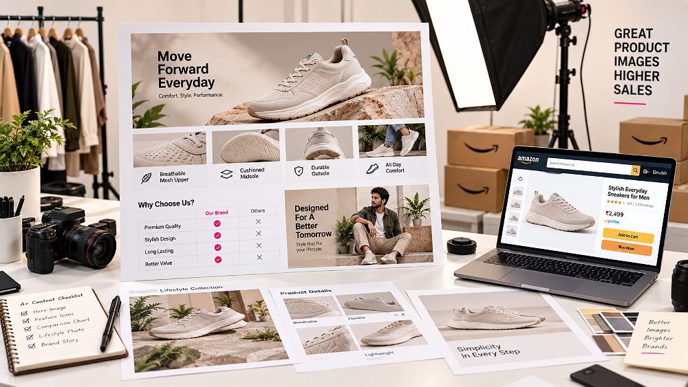
Amazon A+ content is one of the most under-used levers on an Amazon India listing. Most sellers still treat it like a decoration — a banner or two, some bullet points inside images, and a comparison chart bolted on at the end. The brands that actually win on Amazon use their Amazon product photography services and A+ modules together as a single sales journey. This 2026 guide from Ckstudio covers exact image sizes, Basic vs Premium A+ differences, module strategy, photography requirements, examples and the practical workflow we use for Amazon brands in Delhi NCR.
Amazon A+ content is enhanced product-detail content available to eligible brands. Basic A+ uses 970 × 300 px reference images and up to 5 modules from 14 module types, while Premium A+ uses 1464 × 600 px reference images and up to 7 modules from 19 types including video, hotspots and carousels. Amazon states Basic A+ can potentially lift sales by up to 8%, and Premium A+ by up to 20%, when combined with strong ecommerce product photography and a clear listing story.
Amazon A+ content is the enhanced description area that appears below the bullet points on an Amazon product detail page. It replaces plain text with rich modules — images with overlays, feature grids, comparison charts, lifestyle photography, banners, and (in Premium A+) video and interactive elements. For brands using Amazon India as a growth channel, this section is where shoppers actually decide between two similar listings.
Amazon A+ content is only available to brand owners approved through Amazon Brand Registry. Once eligible, you can access A+ Content Manager inside Amazon Seller Central and start building projects that attach to your ASINs. The Amazon A+ listing sits between price and reviews in the buyer’s scroll path, which is exactly where consideration happens.
In 2026, this real estate matters more than ever because ecommerce shoppers in India increasingly compare product detail pages side by side on mobile. A dense wall of bullet points does not compete with a well-planned A+ story. That is why Ckstudio approaches A+ as a photography-plus-design problem, not a graphic design problem alone. Brands that pair a clean listing with intentional category-focused product photography tend to see stronger add-to-cart movement than brands publishing catalogue images alone.
Amazon A+ content renders inside the product detail page as an “Enhanced Product Description” or “From the manufacturer” section. It appears after the standard product description and before the reviews block, which makes it the last major touchpoint before a shopper either adds to cart or leaves. The A+ Content Manager controls exactly how each module is rendered on both desktop and mobile.
A well-built Amazon A+ listing does five things at once. First, it educates the shopper on features that bullet points cannot explain visually. Second, it tells a short brand story that separates you from marketplace competitors. Third, it introduces comparison content that cross-sells the rest of your ASINs. Fourth, it visually answers common pre-purchase questions. Fifth — and most measurable — it usually improves conversion rate on the same paid traffic you were already buying.
According to Amazon’s own guidance, Basic A+ can potentially lift sales by up to 8% and Premium A+ by up to 20%, though real numbers depend on listing quality, product category and image standard. For a practical view of how imagery drives conversions, our note on how product photography improves conversions on Amazon and Flipkart and the workflow behind professional ecommerce photography for higher conversion rates both cover the compounding effect that better images have on paid ads.
Before designing anything, the Amazon A+ content specifications need to sit in front of the design team like a checklist. Getting a single module dimension wrong forces a re-crop, which usually damages product framing. Amazon publishes broad references — 970 × 300 px for Basic A+ and 1464 × 600 px for Premium A+ — but each individual module inside A+ Content Manager has its own working slot. The table below is the quick 2026 reference we hand to every Amazon brand walking into our Delhi NCR studio.
| Specification | Basic A+ | Premium A+ |
|---|---|---|
| Image layout reference | Up to 970 × 300 px | Up to 1464 × 600 px |
| Max modules per project | 5 | 7 |
| Module types available | 14 | 19 |
| Text + images | Yes | Yes |
| Comparison charts | Standard | Enhanced |
| Video | No | Yes |
| Interactive hotspots | No | Yes |
| Image carousels | No | Yes |
| Q&A module | No | Yes |
Important editorial note: Amazon module slots can have different dimensions from the overall image reference above. Always check the exact upload dimensions displayed inside the current A+ Content Manager before exporting final creatives, because Amazon updates module specifications and supported types periodically.
The most common Amazon A+ content design mistake we see at Ckstudio is teams designing at one large canvas size and then compressing that same file into every module. It never works. Amazon A+ image sizes vary by module, and mobile crops behave differently to desktop crops. Below are the working references for both Basic and Premium A+, followed by module-level pixel dimensions.
Use 970 × 300 px as Amazon’s Basic A+ overall image-size reference. Individual module slots inside Basic A+ still use their own sizes — a three-image grid uses smaller squares, a header module uses a wide banner, and a single-image module uses a mid-sized square. Treat 970 × 300 px as the design system reference, not as the size of every export. For a broader view of Amazon’s imaging standards, our post on ecommerce product photography standards for Amazon, Flipkart, Myntra and Shopify in 2026 is a useful companion read for photography teams.
Premium A+ uses 1464 × 600 px as its image-size reference, which is nearly double the Basic A+ visual real estate. This unlocks larger hero images, wider comparison layouts and stronger lifestyle storytelling. The Premium canvas is worth designing for even if you only qualify for Basic today, because upgrading later is much easier when photography assets are already shot at Premium resolution. Brands scaling their catalogue also benefit from planning ahead — see our practical guide on scaling product photography from 50 to 500 SKUs for the operational side of that transition.
Below are the module-specific working references our design team uses for Basic A+. These are working references, not fixed values — Amazon can update dimensions inside Seller Central, so re-check the specific module slot before final export. Building your PSD system around these dimensions is what allows a full A+ project to be produced in one afternoon instead of three.
| Module | Working Image Size | Best Use |
|---|---|---|
| Logo | 600 × 180 px | Brand mark placement |
| Image + text overlay | 970 × 300 px | Hero banner with headline |
| Header image | 970 × 600 px | Large brand statement |
| Single image module | 300 × 300 px | Feature spotlight |
| Three-image module | 300 × 300 px each | Three benefits row |
| Four-image text module | 220 × 220 px each | Four features grid |
| Four-image quadrant | 135 × 135 px each | Icon-style grid |
| Comparison images | 150 × 300 px | Comparison chart thumbnails |
Export sharp high-resolution assets in RGB, using JPG or PNG as supported by the specific module. Keep important product details away from crop edges because Amazon reshapes the layout on mobile, and small text embedded inside images becomes unreadable at phone size. Preview every module on both desktop and mobile before submission. Designing a single banner and forcing it into every A+ module is the fastest way to burn your first project on rework.

The Basic A+ vs Premium A+ decision usually gets decided by eligibility first and story ambition second. Basic A+ is the right choice when the product is straightforward and the goal is to educate the buyer through clean image-and-text modules. Premium A+ is the right choice when the brand needs to tell a larger visual story — video demonstrations, interactive hotspots, side-by-side carousels, and enhanced comparison content across a wider product range.
| Feature | Basic A+ | Premium A+ |
|---|---|---|
| Modules per project | Up to 5 | Up to 7 |
| Module types available | 14 | 19 |
| Larger images | Limited | Yes |
| Video | No | Yes |
| Interactive hotspots | No | Yes |
| Image carousels | No | Yes |
| Comparison tools | Standard | Enhanced |
| Q&A module | No | Yes |
| Best for | Focused product education | Visual brand storytelling |
Basic A+ is the right starting point for most new Amazon brands. If your product is easy to understand in one glance — a single SKU, a straightforward accessory, a simple homeware item — then five well-designed modules covering hero benefit, features, in-use context and a comparison chart is enough to move the needle. It is also the right choice while your team is still learning how the A+ approval cycle behaves.
Premium A+ pays off for brands with a wider ASIN range, higher price points, or complex features that benefit from video and interactive elements. Fashion labels with strong lookbook photography assets, electronics brands with feature-heavy products, and beauty brands that lean on ingredient storytelling all get more mileage from Premium modules. If you already have polished video production assets, Premium A+ is where they belong.
Premium A+ Content is a gated feature. Access appears inside A+ Content Manager only when Amazon confirms the account meets current eligibility requirements. Because Amazon updates these rules from time to time, treat the following list as a working reference and always verify status directly inside Seller Central before promising a Premium A+ project to a client.
Amazon’s currently published requirements ask for three things: an active Amazon Brand Registry enrolment, a Brand Story published across eligible brand-owned product listings, and at least five approved or published A+ Content projects during the previous 12 months. When all three are satisfied, Premium A+ options unlock inside A+ Content Manager. Sellers who are close to eligibility often ask us to help them publish their remaining Basic A+ projects to cross that threshold, and then upgrade.
Every Amazon A+ listing is built by stacking modules from the A+ Content Manager library. Choosing the right combination is more important than filling every slot. Think of modules as sentences in a paragraph — each one carries one specific idea. Below are the module families we use most often, and what each family is genuinely good at.
Standard image-and-text modules are the workhorses of Basic A+. They pair a mid-sized image with a short headline and body copy on either side. Use them for benefits, differentiators, materials, construction details and product usage moments. When paired with strong lifestyle product photography, these modules feel editorial rather than promotional, which lifts perceived brand quality.
Header modules deliver the top-of-page brand statement. This is where hero storytelling lives — a large image with a short overlay line that anchors the brand promise. Use it once, at the very top of the A+ listing. Overloading a project with multiple hero banners dilutes the story and pushes shoppers past your key messages. A strong hero also sets the tone for every module that follows, from features to comparison.
Three-image and four-image feature modules are the fastest way to communicate the 3–4 differentiators that matter most for the product. Keep the icon or product framing consistent across every tile, and write short, scannable headlines. This is the module family where clean ghost mannequin photography for apparel or macro product shots for accessories genuinely earn their weight in click-through.
The comparison chart module is one of the most under-appreciated tools in A+. It lets you place your ASIN alongside four to five related products from your own catalogue, with a shared set of feature rows. Used well, it stops the shopper from clicking away to compare — because the comparison is already on the page. Used poorly (only ticks against your ASIN, only crosses against the rest), it looks manipulative and Amazon reviewers can reject it.
Premium A+ opens the door to video modules, interactive hotspots and image carousels. These formats shine for complex products, high-consideration purchases, and feature-heavy electronics or appliances. A 45–60 second product video sitting inside the A+ listing removes the friction of clicking away to a separate video player. Hotspots let a shopper explore a lifestyle scene, and carousels compress multiple product angles into one module without eating the whole page.
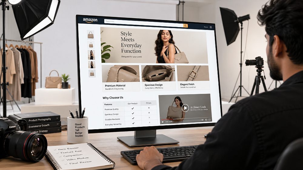
After a few hundred A+ projects, we noticed the highest-performing listings all follow the same underlying flow. So we packaged it into a simple internal framework and now use it as the module-map for every new Amazon A+ project at Ckstudio.
Every strong Amazon A+ listing walks the shopper through five stages, one module at a time.
The first module has one job: communicate the single strongest reason to buy. Use a header module or an image-with-overlay module, a clean lifestyle photograph, and one short headline. This is not the place for a features list. If a shopper cannot understand the product’s core benefit within three seconds of scrolling into your A+ listing, the rest of the modules will not save it.
The second and third modules explain what the product actually is — its shape, materials, feature set, and how it looks in a real-world context. This is where lookbook and lifestyle photography assets do their heaviest lifting. If you sell apparel, this is also where correctly-shot garment photoshoot content and on-model images belong.
Module four zooms into the details that back up the promises made above — construction, materials, feature callouts, dimensions and accessories. Macro detail shots and feature callouts turn abstract claims like “premium build quality” into visible, verifiable proof. This is also a strong place for infographic-style modules that translate specifications into visual comparisons.
Module five is often the comparison chart. Place your target ASIN alongside three or four related products from your own catalogue so the shopper can pick the correct variant without leaving the page. This module is also where cross-sell happens: a shopper looking at a base model might realise the mid-tier variant is the better fit for their use case, which is a healthier outcome than losing them to a competitor.
The final module wraps up the visit with brand reassurance — a short line about the brand’s heritage, quality commitment, or Amazon-verified badges. This is the module that gently converts hesitant shoppers into buyers by removing the last “is this a real brand?” doubt. If Brand Registry gives you access to the Brand Story feature, use both together for compounded trust.
Amazon A+ content photography is where most projects quietly fall apart. Teams pull catalogue images that were shot for the main listing, drop them into A+ modules, and wonder why the layout feels flat. The right approach is to plan the A+ module map first, then shoot photography specifically for those modules. That is exactly the workflow our team follows for every Amazon product photography project, and it is the single biggest lever available to any Amazon brand today.
Every A+ listing needs a solid base of clean product-only shots — a hero angle on a neutral background, at least two secondary angles, and a couple of tight detail crops. These images are the visual grammar of the whole A+ project. If they are inconsistent in scale, lighting or colour, the finished listing will feel amateur no matter how good the layout is. For a broader look at where these images belong on a listing, see our note on how many ecommerce product photos per listing a brand typically needs.
Lifestyle photography answers the questions bullet points cannot: who uses this, where does it belong, and what does life look like with it? A single strong lifestyle scene can carry an entire module. Photograph the product in its real environment — a kitchen, a workspace, a bedroom, an outdoor setting — with human elements that reflect the target buyer. Indian brands often skip this step because it costs more per shot; the trade-off is a flatter listing that competes only on price.
Detail photography exists to make claims visible. If the copy says “reinforced stitching,” the module needs a macro shot of the stitching. If it says “brushed metal finish,” you need a close-up that captures the finish under directional light. Detail shots also fill four-image and quadrant modules cleanly because they crop well to square and small formats.
The most important shift for any Amazon A+ content project is to shoot with module crops in mind — not to design A+ Content afterward from a random pile of catalogue photos. Approve the A+ module map first, brief the photography around those exact aspect ratios, and every asset that comes out of the shoot will land in a module without ugly re-cropping. This is how Ckstudio protects a shoot budget from being wasted on unusable frames, and it is a habit worth adopting even if the shoot happens in-house.
Amazon A+ content design is a discipline of restraint. A shopper on mobile is scrolling fast, comparing your product to two others in a competing tab, and making a decision in seconds. The design job is not to fill every module with everything you know about the product — it is to say one clear thing per module and let the visual do the heavy lifting.
Every module should carry exactly one idea. A feature module talks about one feature, not four. A comparison module compares four ASINs on one dimension the buyer cares about, not eight rows of specifications. This single rule prevents about 80% of the “cluttered A+” problems Amazon brands ask us to fix.
The majority of Amazon India traffic is mobile. Mobile crops A+ modules differently, and small text embedded inside images becomes unreadable at phone size. Keep important product details safely inside the mobile-safe zone, use native module text instead of baked-in image text wherever possible, and always preview both breakpoints inside A+ Content Manager before submitting. If the module reads well on a 6-inch screen, it will read well on desktop.
Amazon strongly prefers text that lives in the module’s native text field, not text burned into the image. Native text is searchable, accessible to screen readers, easier to translate, and does not blur on low-resolution devices. Reserve in-image text for short headlines or callouts where the type has a genuine design function, and let the module do the rest.
Across a full Amazon A+ listing, the visual system needs to feel like one project. That means consistent fonts, one background treatment, a single icon style, matching product scale between modules, and photography with a shared lighting language. When those choices drift module to module, the listing feels stitched together instead of intentionally designed. The same visual discipline shows up in our post on ecommerce catalog photography consistency at scale, which covers the same problem at the SKU-catalogue level.
Below is the five-module Basic A+ structure Ckstudio uses as a starting point for most Amazon brands. It maps directly onto the Hook → Explain → Prove → Compare → Convert framework and gives a shopper a complete story in the time it takes to scroll through the section.
A header image with a short overlay headline that communicates the strongest customer benefit immediately. One image, one line, no bullet points. This is the hook that earns the next four modules a chance.
A three- or four-image feature grid showing the 3–4 most important differentiators visually. Icons or product crops instead of stock imagery, with short scannable headlines under each.
A lifestyle module that shows the product in its real environment — being used by a person who matches the target buyer. This is the module that answers “is this for me?” and is where good lifestyle photography earns most of its return.
A close-up module that supports purchasing confidence — stitching, material texture, technology or construction detail. Buyers who are close to a decision want visible proof that the product is well-made.
Either a comparison chart that cross-sells the rest of the range, or a brand reinforcement module that closes with brand promise and trust. Choose based on catalogue depth — brands with more than one relevant ASIN benefit from the comparison, single-SKU brands benefit from brand reinforcement.
Premium A+ extension: when Premium modules are available, add a product video after Module 2, an image carousel or hotspot in place of Module 4, and an enhanced comparison chart in Module 5. Do not add these just because they are available — add them where they genuinely improve product understanding.
Different Amazon product categories answer different buyer questions. Below is the shorthand we use when we brief a photography and design team on category-specific A+ content requirements. The pattern is stable across most Indian ecommerce brands.
| Category | Priority Content | Recommended Photography |
|---|---|---|
| Fashion & Apparel | Fit, fabric, details, styling | Model + garment detail |
| Jewellery | Craftsmanship, scale, finish | Macro + model/lifestyle |
| Beauty | Benefits, texture, ingredients | Product + texture + lifestyle |
| Home & Living | Dimensions, use cases, materials | Lifestyle + detail |
| Electronics | Features, compatibility, specs | Product + feature close-ups |
| Accessories | Material, function, styling | Product + lifestyle |
Category-specific coverage is available across our service pages — fashion photography, jewellery photography, beauty and cosmetic photography, electronic product photography — and each category benefits from a slightly different A+ module map.
Prince and the Ckstudio team plan photography and A+ module design together — so your assets slot into modules without re-cropping. Talk to us before your next Amazon shoot.
Call Prince: +91-8700258773 WhatsApp UsOnce the module map, copy and photography are ready, the actual build inside Amazon Seller Central takes an afternoon. Below is the seven-step workflow the Ckstudio team follows for every Amazon A+ content project.
Log in to Amazon Seller Central and navigate to A+ Content Manager, usually under the Advertising or Merchandising menu. If you do not see A+ Content Manager, verify Brand Registry status. This is where every A+ project is created, edited, submitted for approval, and published to ASINs.
Choose between Basic A+ or Premium A+ Content depending on eligibility. Premium options appear inside A+ Content Manager only for eligible accounts. Give the project a clear internal name — usually “Brand — Product Name — A+ v1” so future updates are easy to trace.
Pick modules from the available library and arrange them to match the Hook, Explain, Prove, Compare, Convert flow. Basic A+ allows up to five modules per project; Premium A+ allows up to seven. Resist the urge to fill every slot — a clean four-module project usually outperforms a cluttered seven-module one.
Upload module-specific images at the correct working dimensions and add short, scannable text into the native text fields. Keep headlines under eight words and body copy under 30 words per block. Small text embedded in images should be avoided wherever native text will do the job.
Attach the A+ Content project to the correct parent and child ASINs in the catalogue. If you sell multiple variants of the same product, applying the project to the parent ASIN cascades it to all children. This is also where common mistakes happen — attaching to a wrong ASIN forces a resubmission.
Use the built-in preview inside A+ Content Manager to review desktop and mobile layouts. Check that important product details are inside the mobile-safe zone, that headlines are readable at phone size, and that the module order still tells the same story on mobile that it does on desktop.
Submit the A+ Content project for Amazon review. Approvals typically take a few business days, though timelines vary. If Amazon rejects the project, the rejection note usually explains the exact issue — most commonly small text inside images, unverifiable claims, or third-party trademarks. Fix and resubmit.
Print this checklist and pin it above every Amazon A+ content project the team touches. It has saved more resubmissions than any single design tool we use at Ckstudio.
Most rejected or under-performing Amazon A+ content projects fail for the same six reasons. Any team producing A+ regularly will recognise all of them.
Dropping the same catalogue images that already sit in the main image gallery into A+ Content Manager wastes the entire section. A+ modules exist to add information the main gallery cannot. If the A+ listing shows the same images the shopper has already seen scrolling above, there is no reason to keep reading.
A+ is not a banner ad. Modules designed like Facebook creatives — heavy overlays, aggressive typography, discount stickers — get rejected by Amazon and look distrustful to shoppers. Editorial restraint outperforms advertising energy every time in this section.
Small text embedded in module images blurs at mobile size, breaks accessibility, and is a common rejection reason during A+ approval. Move text into the native module text fields wherever the module supports them, and keep in-image text to short headlines only.
Designing only for desktop and skipping the mobile preview is how important product details end up cropped out at phone size. Amazon’s mobile layout reshapes modules independently — always confirm the mobile view inside A+ Content Manager before submitting the project.
If an A+ module simply repeats what is already in the bullet points at the top of the listing, it adds no value. Every module should either show something the bullets cannot (visuals, comparison, context) or say something the bullets could not (brand story, testing, guarantees).
Picking modules first and writing copy to fill them is backwards. Start with the buyer journey — what they need to know at each scroll point — then choose the module that answers that question. Following the Hook → Explain → Prove → Compare → Convert flow prevents this mistake at the planning stage.
Effective Amazon A+ content production sits at the intersection of creative strategy, module planning, product photography, lifestyle photography, graphic design and mobile-safe compositions. When those disciplines are handled by different teams that never talk to each other, the finished A+ project usually feels stitched together. When they are planned together, the final Amazon A+ listing reads like one visual story.
Ckstudio works as a photography and ecommerce creative partner for Indian brands that need Amazon A+ content photography and design-ready imagery in Delhi NCR. Our team handles module planning, product photography, lifestyle photography, comparison-chart imagery, mobile-safe composition and final export-ready assets. For brands already exploring the space, our post on Amazon product photography complete seller’s guide 2026 and Amazon photography services guide 2026 both explain the imagery layer that sits underneath A+.
If you are weighing image production choices, our detailed comparison on AI Amazon photography vs studio photography for 2026-27, along with the broader look at real photography vs AI generated product images, is worth reading before you commit to a full A+ project. Our experience remains consistent: for Amazon A+ content, real professional product and garment photography outperforms AI-generated images on trust, detail accuracy and rejection risk.
Prince and the Ckstudio team plan photography and A+ modules together — so the story reads as one from hero to comparison. Book a consultation for your next Amazon listing.
Call: +91-8700258773 Email: [email protected]The strongest Amazon A+ listings in 2026 will not be the ones that fill every module slot — they will be the ones that build a logical visual sales journey. Attention, understanding, proof, comparison, confidence, all delivered in five to seven modules that respect the shopper’s time on mobile. Photography, copy and module design belong together in that plan from the very first meeting.
Whether you launch on Basic A+ this quarter and grow into Premium A+ over the next twelve months, or step directly into Premium with a strong Brand Story and video assets, the discipline is the same: one message per module, module-first photography, native text over baked-in text, and a mobile preview before every submission. That is how Ckstudio helps Amazon brands ship A+ listings that hold up against competitors on the same detail page.
Amazon A+ Content is enhanced product-detail content available to eligible brands. It combines images, formatted text, comparison information and other visual modules to explain products and strengthen brand storytelling on the Amazon product detail page.
Amazon lists 970 × 300 px as the Basic A+ image-size reference and 1464 × 600 px for Premium A+. Individual modules can require different dimensions, so always confirm the selected module inside A+ Content Manager before final export.
Basic A+ supports up to five modules from 14 module types. Premium A+ supports up to seven modules from 19 types and adds richer features including video, hotspots, carousels, larger images and enhanced comparison tools.
A+ Content is primarily a brand-building feature for eligible brand owners. Sellers should check their Brand Registry status and current A+ Content Manager access in Seller Central before creating content, since eligibility rules can be updated by Amazon.
Amazon states that Basic A+ Content can potentially improve sales by up to 8%, while well-implemented Premium A+ Content can potentially improve sales by up to 20%. Actual results vary by product, content quality, category and traffic.
For pricing and workflow context around the photography assets that feed into an Amazon A+ project, see our notes on product photography pricing India 2026 and the ecommerce photography pricing guide 2026. Brands weighing city-level options can also review our product photography cost in Delhi and product photography cost in Mumbai breakdowns before scheduling a shoot. For sellers on other marketplaces, our companion guides on Flipkart photography guidelines 2026, Meesho product photography, and Ajio seller image guidelines 2026 extend the same principles across the wider marketplace mix. Broader strategy context is available in our ecommerce photography services complete guide 2026, ecommerce photography workflow, and ecommerce image optimization guide.
Prince founded Ckstudio to bring photography, editorial thinking and marketplace expertise into one team. If you are planning your next Amazon A+ project, reach out on +91-8700258773, WhatsApp +91-8700258773, or email [email protected]. A short conversation is usually enough to decide whether to shoot for Basic A+ or design straight into Premium.
Next step: read the complete Amazon seller guide 2026.